From heart to paper – how the Sarcomafund visuals were born?
Vilja Linnean Sarkoomarahaston ohjausryhmä pyysi Sarkoomarahaston visuaalisen ilmeen suunnittelijaa, visual designer Sophia Ståhlbergiä, kertomaan suunnitteluprosessista. Lue alta Sophian mietteet suunnittelutehtävästä ja visuaalisen ilmeen syntymisestä.
The Sarcomafund team requested me to create the brand identity for their fund, which pays tribute to Vilja Linnea’s battle against cancer. They presented their story and goal of spreading knowledge and awareness of a rare form of cancer, as well as encouraging cooperation within sarcoma specialists and increasing sarcoma research.
In designing the brand identity for a fund so rooted in a personal story, I needed to understand the narrative. I immersed myself in understanding Vilja’s journey: her passions, aspirations, and the impact she made on those around her, but also the brand’s mission, values, and target audience. This understanding served as the foundation for crafting the brand identity that reflects her spirit and resonates with the fund’s purpose. Through the design process, it was important for me to maintain open communication with the Sarcomafund team — to listen to their insights and desires for the brand identity. Their involvement ensured that the design stayed authentic to their vision.
The most important part comes from the origin of this fund, Vilja Linnea’s life story. She was described to me as a kind, ambitious, and nature loving young woman. I saw her artistic side through photographs taken by her and drawings made by her, most of them depicting nature; it was a given that the brand identity was going to have a nature theme.
With a well-defined brief in hand, it was time to brainstorm and conceptualise the visual elements that will form the brand identity. My aim for the brand’s design was to create something that reflected Vilja’s essence and her love for nature. Nature has a soothing and calming effect, and I wanted that presence in the design. I wanted it to focus on positivity, and a feeling of calmness, and at the same time create a shape that is recognisable for anyone. This logo’s inspiration comes from Vilja’s photos and drawings of mushrooms. The logo’s design is meant to be memorable and reflects the brand’s personality. Its round, soft shapes and the rays on the logo are inspired from the sun rays, and a mushroom’s gills. The shape of the gills gives the logo a more organic shape, radiating an active fund which is striving towards a new day filled with opportunities to teach about sarcoma and finding new treatments for sarcoma cancers.
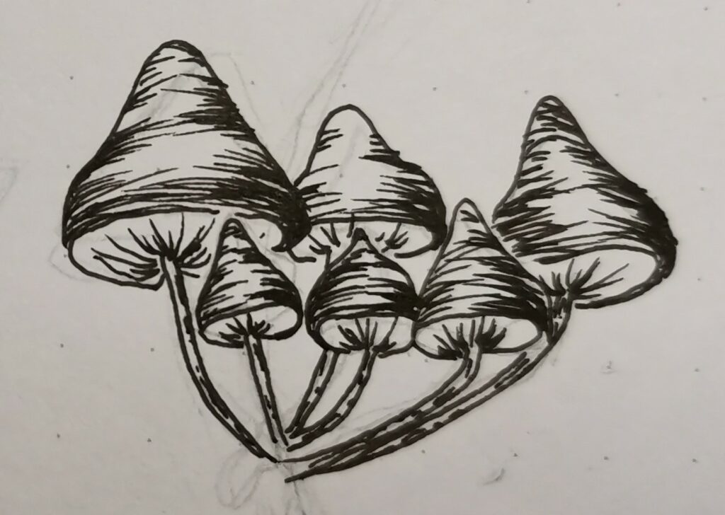
Vilja’s drawing.
The team knew they wanted to use a green nuanced colour as a main colour. The colour palette was meant to balance soothing tones and evoking feelings of comfort, strength, and optimism. After exploring a few variations, the colours chosen for this brand are inspired by the deep green forests in Finland, and a soft pale blue colour as a compliment, which portrays the clean air and water Finland offers.
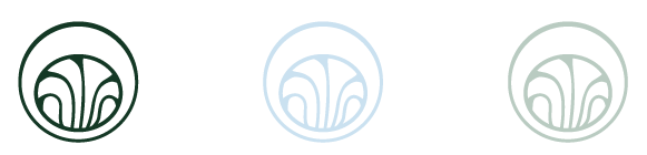
Logo icon in brand colours.
Designing a brand identity for a fund born from a personal story and the loss of a young woman was challenging both on an emotional and on a creative level. By embracing the personal story and using sensitive design choices, we were able to tie together their brand identity.
The brand we created together is captured by the website and will be present in their social media online present and other presentations. I encourage you to explore the site, and feel free to contact me with questions regarding my work for the Sarcomafund.
Sophia Ståhlberg